
Due the COVID pandemic, Netflix wants to improve engagement and retention in their service. To do so, they are looking to expand on their social capabilities as an increased number of users are physically distancing and spending more time at home watching content. With this in mind, I started with research to get a better understanding of current user behaviors and uncover potential frustrations.

“Browsing casually is hard because there are so many different options. It's more difficult to find something specific” -User T
“I've had to look for workarounds, like Kast or Discord, to watch with my boyfriend but the technical difficulties can be annoying” -User D
“My group and I would time our playback and countdown while on Google Hangouts or sometimes we would just screenshare”-User O
Based on the information gathered from research, I created a persona to better represent the target users and better inform my design decisions. The persona represents young adults who experienced significant changes to their social lives following the global pandemic. They are stuck at home consuming a lot of content but still want to feel connected their friends. After getting a better sense of who the target users are, I formulated How Might We questions to start brainstorming ideas.

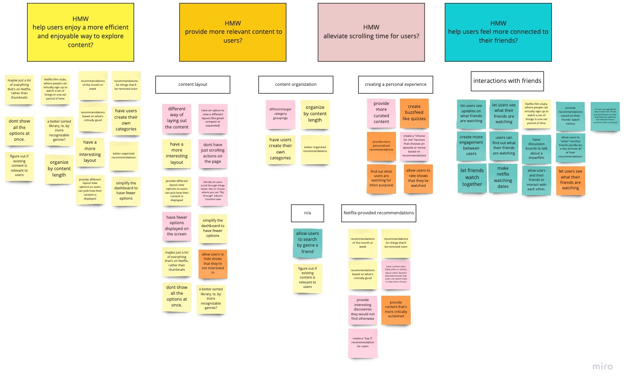
After a brainstorming phase to come up with possible solutions to these questions, I finalized two features to add to Netflix.
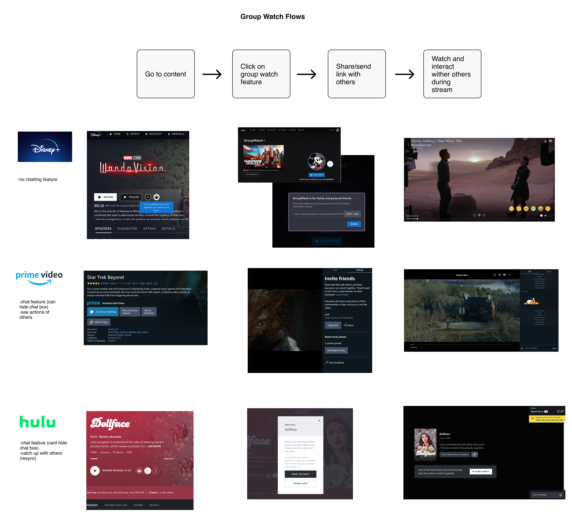
With these two new feature ideas, I laid out the existing Netflix sitemap to better understand the information architecture and determine how to organize the new features within the platform. Then, I put together user flows to determine how users would navigate the site to accomplish their goals. I also looked at the existing flows for the group watch feature on competitor sites to get some ideas on how to design it in Netflix.
After exploring existing flows, I began sketching and creating the lo-fi designs to start visualizing the layout of the new Netflix feature. The challenge here is to keep the design consistent with Netflix's existing UI.
The primary focus of the design is to make the interface as simple and straightforward as possible. During the user interviews, participants expressed that Netflix can be overwhelming so it’s my goal to not add to that overwhelming feeling. In terms of the group watch feature, other competitors grouped that action item with others so I did the same and added the feature alongside other main action items. After narrowing down the different designs, I created hi-fi mockups that I would eventually use as my prototype for testing.


When thinking about how to help users feel more connected with others through Netflix, I started with an idea that would allow Netflix users to see their friends’ Netflix activities. However, after determining its effort to implement and impact, I changed directions and came up with two different feature ideas based on the information gathered from the research. When starting this project with a solution(s) in mind, I ended up with confirmation bias in order to support those initial ideas. In some cases, starting off with some solutions may work but I learned that it was not the case for this project!
With additional time, I would continued to iterate, based on feedback from users, to further elevate the experience for these two new features and do another round of testing. Many users reported that they use their Smart TVs to watch Netflix and wondered how these two features would translate there so I would also take that as an opportunity to explore that area as well. It would also be worth exploring implementing voice and/or video chatting functions within Netflix.